Some time ago, I saw a presentation by Wouter van Atteveldt who showed that wordclouds aren’t necessarily stupid.
I was amazed since wordclouds were one of the first things I ever did in R and they are still often shown in introductions to text analysis.
But the way they are mostly done is, in fact, not very informative.
Because the position of the individual words in the cloud do not mean anything, the only information communicated is through the font size and sometimes font colour of the words.
Usually these devices are used to show word counts and group membership—both could be shown more easily using a ranked table or bar plot.
What set Wouter’s approach apart from anything I had seen before, was that he used the x-axis to indicate over-representation of words by one of the text authors.
I reproduced the plot some time ago with my own data, but found it relatively hard to wrap my head around the corpustools package.
(It has since been rewritten and I definitely still want to check it out.)
Today I found the ggwordcloud package which wraps the task of producing wordloud plots into a familiar ‘grammar of graphics’ approach used by ggplot2 and other related packages.
Therefore I thought it makes sense to give it ago trying to reproduce the non-stupid wordclouds and maybe even go a step further.
library("ggwordcloud")
library("quanteda")
library("dplyr")
library("sotu")
quanteda_options(verbose = TRUE)
I’m using the State of the Union Addresses data from the sotu package since this includes the information used in the presentation.
sotu_meta %>%
  filter(!duplicated(president, fromLast = TRUE)) %>%
  tail()
## # A tibble: 6 x 5
## president year years_active party sotu_type
## <chr> <int> <chr> <chr> <chr>
## 1 Jimmy Carter 1981 1977-1981 Democratic written
## 2 Ronald Reagan 1988 1985-1989 Republican speech
## 3 George Bush 1992 1989-1993 Republican speech
## 4 William J. Clinton 2000 1997-2001 Democratic speech
## 5 George W. Bush 2008 2005-2009 Republican speech
## 6 Barack Obama 2016 2013-2016 Democratic speechWe see that the data set ends with Obama’s last address. So I will compare him against his predecessor first and then explore and easy pipeline to do a comparison to a number of others.
sotu <- sotu_meta %>%
  bind_cols(text = sotu_text) %>%
  mutate(docnames = paste(president, year, sep = ": "))
sotu
## # A tibble: 236 x 7
## president year years_active party sotu_type text docnames
## <chr> <int> <chr> <chr> <chr> <chr> <chr>
## 1 George Was… 1790 1789-1793 Nonp… speech "Fellow-Citiz… George Wa…
## 2 George Was… 1790 1789-1793 Nonp… speech "\n\n Fellow-… George Wa…
## 3 George Was… 1791 1789-1793 Nonp… speech "\n\n Fellow-… George Wa…
## 4 George Was… 1792 1789-1793 Nonp… speech "Fellow-Citiz… George Wa…
## 5 George Was… 1793 1793-1797 Nonp… speech "\n\n Fellow-… George Wa…
## 6 George Was… 1794 1793-1797 Nonp… speech "\n\n Fellow-… George Wa…
## 7 George Was… 1795 1793-1797 Nonp… speech "\n\nFellow-C… George Wa…
## 8 George Was… 1796 1793-1797 Nonp… speech "\n\n Fellow-… George Wa…
## 9 John Adams 1797 1797-1801 Fede… speech "\n\n Gentlem… John Adam…
## 10 John Adams 1798 1797-1801 Fede… speech "\n\n Gentlem… John Adam…
## # … with 226 more rowsNow I can do the pre-processing in quanteda:
sotu_dfm <- sotu %>%
  corpus(
    docid_field = "docnames",
    text_field = "text"
  ) %>%
  dfm(
    select = "[[:alpha:]]",
    valuetype = "regex"
  ) %>%
  dfm(
    remove = stopwords()
  )
## Creating a dfm from a corpus input...## removed 2 features
## ... lowercasing
## ... found 236 documents, 32,582 features
## ... kept 27,669 features
## ... created a 236 x 27,669 sparse dfm
## ... complete.
## Elapsed time: 2.36 seconds.
## Creating a dfm from a dfm input...
## ... lowercasing
## ... removed 169 features
## ... created a 236 x 27,500 sparse dfm
## ... complete.
## Elapsed time: 0.167 seconds.At this point, let us begin with a “stupid” wordcloud.
It’s already interesting to get at look at it since the syntax of the ggwordcloud fits in nicely with what I already knew from regular ggplot2
sotu_dfm_cmp <- sotu_dfm %>%
  dfm_subset(
    president %in% c("George W. Bush", "Barack Obama")
  )

set.seed(1)
textstat_frequency(sotu_dfm_cmp, 50, groups = "president") %>%
  arrange(-frequency) %>%
  ggplot(aes(label = feature, size = frequency, colour = group)) +
  scale_size_area(max_size = 7) +
  geom_text_wordcloud(show.legend = TRUE) +
  theme_minimal()
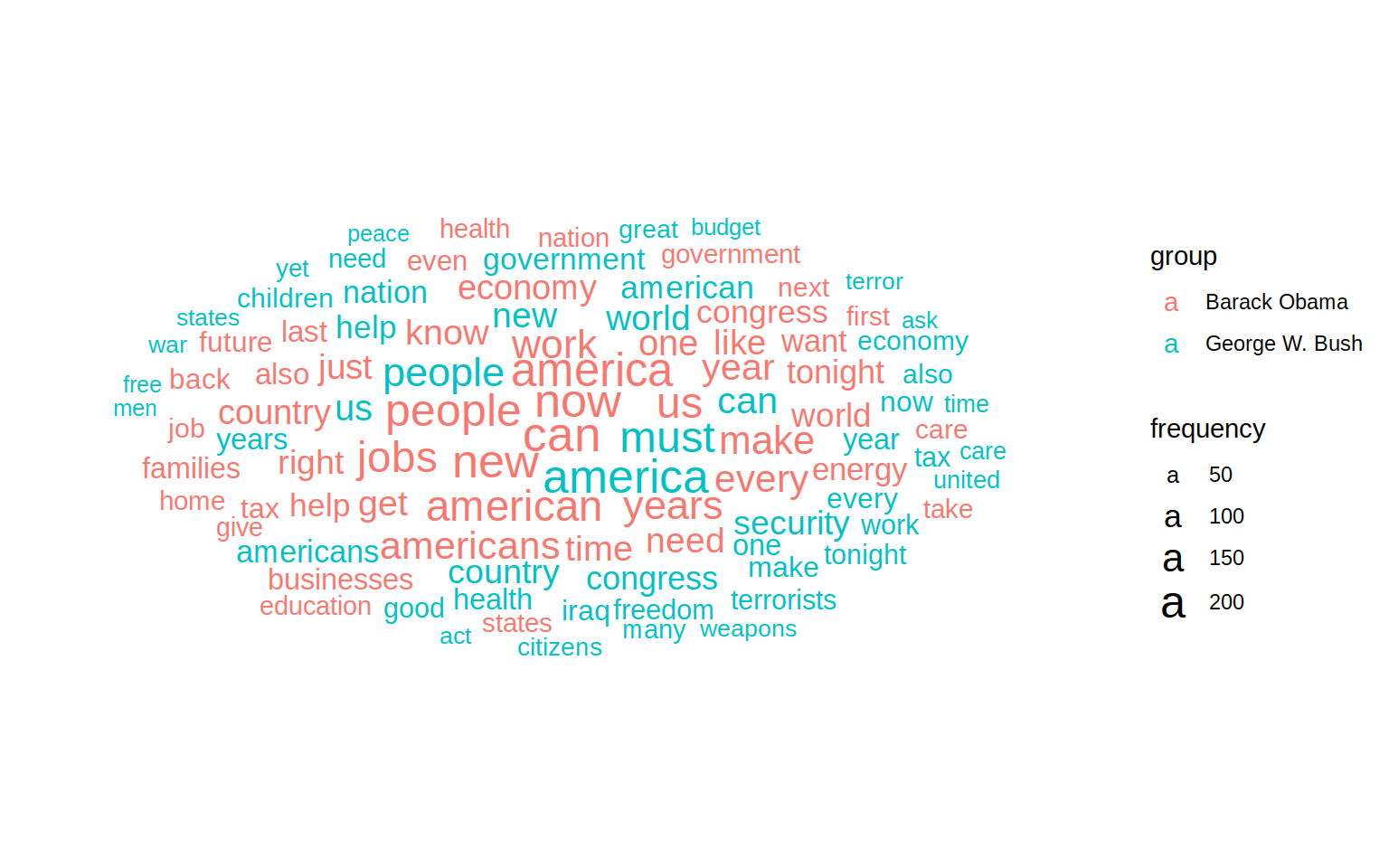
This shows us some some interesting things. america and congress are in the middle and large for both presidents, meaning it was used most often. Bush uses words like freedom and terror while Obama about the economy, jobs and the word now. But it’s hard to make out as many words appear twice and usually not very close to each other.
It’s easier to let an algorithm figure out which words are key to one president compared to the other.
We can do that using the keyness command from quanteda:
keyness <- sotu_dfm_cmp %>%
  textstat_keyness(which(docvars(., "president") == "Barack Obama"))
head(keyness)
## feature chi2 p n_target n_reference
## 1 jobs 61.53717 4.329870e-15 179 38
## 2 get 44.57363 2.449685e-11 124 25
## 3 now 35.73363 2.262253e-09 217 79
## 4 businesses 33.24494 8.125074e-09 84 15
## 5 just 30.45912 3.409768e-08 117 32
## 6 college 28.00028 1.212980e-07 54 6As noted above, jobs and now seem more important in Obama’s speeches. But in this table a few more interesting words pop up like college and businesses. These didn’t show up before as their overall usage is less frequent overall.
In Wouter’s plot, he used an over-representation measure which I find interesting and since it is easy enough, we can calculate it ourselves:
keyness_over <- keyness %>%
  mutate(total = (n_target + n_reference),
         relfreq_target =  (n_target + 1) / (total + 1),
         relfreq_reference = (n_reference + 1) / (total + 1),
         Overrepresentation = log((relfreq_target) / (relfreq_reference)))
Basically, we are looking at the relative term frequency of the target divided by that of the reference. The \(+1\) in the formula above is simply a smoothing term, so we don’t get problems where n_target or n_reference is \(0\). After arranging this new keyness data by total frequency, we can plot it
plot_data <- keyness_over %>%
  top_n(130, total) %>%
  arrange(desc(total))

plot <- plot_data %>%
  ggplot(aes(
    x = Overrepresentation, y = 0,
    label = feature, size = total, colour = Overrepresentation)
  ) +
  geom_text_wordcloud() +
  scale_size_area(max_size = 7) +
  scale_colour_gradient(low =  "red", high = "blue") +
  theme_minimal()
plot
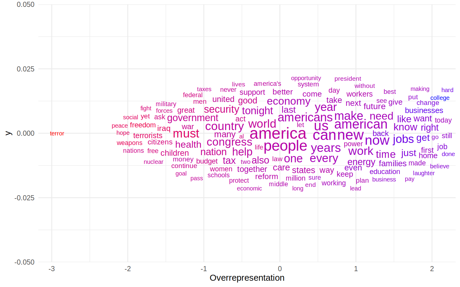
The plot needs a little explanation. A higher over-representation in this case means that a word appears significantly more often in Obama’s speeches than in the reference corpus—in this case the State of the Union addresses of George W. Bush.
As noted above, we can see that america is right in the middle, meaning it is used equally often by both presidents. The word furthest on the left is terror which is something only Bush used in his speeches. On Obama’s end of the spectrum we find a few interesting words like families, college, jobs and change.
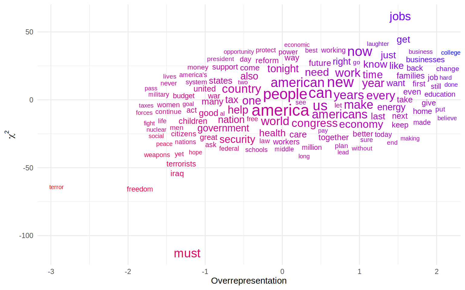
But wait, there is more! If using the x-axis was a step forward, how about also employing the y-axis of the plot? Since we have two different measures of keyness, we can use both in the plot to compare which words are more prominently drawn into one of the corners. We can also set something as y-axis:
plot_data %>%
  ggplot(aes(
    x = Overrepresentation, y = chi2,
    label = feature, size = total, colour = Overrepresentation)
  ) +
  geom_text_wordcloud() +
  scale_size_area(max_size = 7) +
  scale_colour_gradient(low =  "red", high = "blue") +
  theme_minimal() +
  ylab(expression(chi^{2}))
Now the \(\chi^2\) and over-representation do something very similar here, namely indicating which words are used more in one corpus compared to a reference collection of text. Theoretically, this means the words should be plotted along an axis going from the left lower to the right upper corner. But we can see that some words are picked up more prominently in one of the measures. must, for example is the most negative on the \(\chi^2\) axis but not quite as negative in the over-representation index. Comparing this to a few more ‘well-behaved’ words we can see that \(\chi^2\) seems to be influenced by the total number to a larger degree
plot_data %>%
  select(feature, total, n_target, n_reference, chi2, Overrepresentation) %>%
  filter(feature %in% c("must", "terror", "freedom", "college"))
## feature total n_target n_reference chi2 Overrepresentation
## 1 must 242 54 188 -112.87159 -1.234414
## 2 freedom 86 11 75 -65.68373 -1.845827
## 3 college 60 54 6 28.00028 2.061423
## 4 terror 57 2 55 -64.14577 -2.926739The \(\chi^2\) for must is almost twice as low as terror, even though the ratio here is far more extreme for terror (28 times more often used in the reference set than in the target set) than for must (only used 3.5 times as often in the reference set).
The wordcloud in this case served a real purpose of identifying differences not only between the target and reference corpus, but also between the two keyness measures employed here. And we haven’t yet tapped the full potential of the plot either. The colours above show over-representation which is also displayed on the axis. It would be easy to map this to another variable if you can think of one. So that proofs: wordclouds are not necessarily stupid.